In what seems like years ago now, I was once asked to implement a new cutting-edge set of data visualization tools for a big ERP implementation. At that time, I had mostly been asked just to reproduce existing Excel-based types of reports. After all, it was what people were most comfortable with and what they knew. It was traditional and seen as the way things had always been done. As I sought to gain buy-in and adoption from our stakeholders, I was met with resistance and a lack of trust for the visual style reports that we made available. Over time, as comfort and maturity with the new system increased, tools like Tableau® and Microsoft Power BI® were on the rise, and a shift started to form in the acceptance of using data visualizations for managing work.
Today, with the right “data viz” tools, tools that provide customizable, interactive, even sharable dashboards, you can build comprehensive visualizations that truly help your clients and projects in ways that connect people and systems with new transparency and understanding. The speed at which decisions can be made when presenting information in a visual format is staggering in comparison to what it takes going line by line through pages of numbers. But creating effective data visualizations, that require little explanation and immediately draw attention and provide insights, can be challenging. What follows are a several best practices in creating your data visualizations that can help get you where you need to go.
Color and Layout Count
When it comes to the topic of color in your data representations, especially within today’s best dashboards, it can be tempting to use lots of it because, well, it looks great and can seem impressive. But think of it this way: if everything has color, then nothing will really stand out. So, it’s wise to use color sparingly for your best impact. Ask yourself, what story is your data report or chart trying to tell, and will it communicate the right information that the viewer needs to see? Don’t use it just for the sake of using it, but only when there is meaning behind it.
For instance, if you’re going to show positive and negative values, what is the information that you want to have “pop” out of that? If the information you want the user to be aware of first is a negative number (so they can go fix the issues represented by that number) then that’s what you want to be seen first. In that case, you may want to have a bar chart or a tree map that has fairly muted colors where the negative numbers are something that catches the eye. You want to limit the number of colors you use, though, so you don’t overwhelm the viewer.
Let’s go the other way now. Say you use all grays in a chart. There will likely be an almost knee-jerk reaction from the viewer that this chart doesn’t have the information they need. So again, color is key. And keep in mind that about 8% of men (one in 12) and 0.5% of women (one in 200) have some form of red-green color blindness. This is the reason that blue and orange are common colors in some tools to represent positive and negative in place of the more traditional green and red.
Another very important visual element to keep in mind is how the viewer will read the chart. In the U.S., for instance, people read from left to right. Making sure to place the most important information in the top left and top right is therefore key. It is the most valuable real estate on a dashboard, and if you only have a few seconds to make an impression, that’s a great place to start. Metrics that provide actionable information or require action are good contenders for occupying that space. The lower left and right can have more descriptive/informative information, but not necessarily a metric that requires immediate action. A good rule of thumb is to try out your dashboards/visualizations on a non-practitioner and do some usability testing to understand where they are looking first, what is catching their eye and what isn’t grabbing their attention.
Label for Clarity
Often overlooked are the texts you include with your visualization, such as labels or annotations. For example, you may have a bar chart you want to use. However, if you don’t have meaningful and understandable labels, such as chart title, axis labels or a legend, you can lose a lot of the context behind it. So, the data labels are very important, especially with positive and negative values. Keep your labels clear and not too dense. It is also a best practice to include an annotation that is brief but describes what is happening in the chart very clearly. For example, “Sales have trended down 10% over the last three months” is a fast, easy way to tell the viewer exactly what you want them to take from the visualization. The text supports the visual that is telling that story without being overwhelming or requiring a significant amount of analysis or effort to read.
Positive and negative values can often be difficult to clearly label, so a great trick for adding more clarity is using patterns and/or shapes. If you’re doing a KPI dashboard where you may have a user requirement that the KPIs are reflected as positive values, make them blue and potentially include a “+” sign. Or if you have a project owner who requires the use of red and green colors, using either an up or down arrow clearly indicates which is considered good versus bad. If you have negative numbers, you want to be able to clearly mark where zero is. So, it’s important the type of visualization that you’re using can support reflecting both positive and negative numbers.
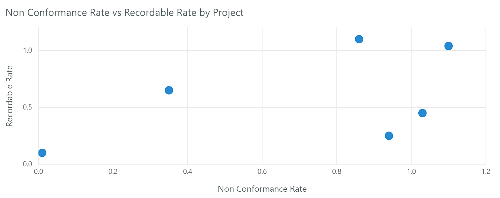
You may also want to use symbols or patterns to reflect different categories in a visualization. Say you’re doing a scatterplot visualization where you have different work categories and it’s important to draw the difference between categories to your user. Try using different shapes, like a circle for one, then a triangle or an “X” for another to represent the different categories. This allows the user to quickly realize that for Category A, it is always represented by a circle and Category B is represented by an “X.” Whatever you decide, be consistent in your choices of symbols and labels.
Let Communication Choose Your Format
Data visualization is all about communication. So, always think about what you’re trying to communicate before you choose your format. If you’re trying to communicate an amount, it’s very difficult for viewers to tell proportions by simply looking at an area, such as with a pie chart. People are much better at discerning differences from length than they are from an area. So, when you’re trying to communicate amounts or provide comparisons, bar charts can be very effective.
Then there are bullet charts. They basically look at where you are now versus where you were or where you want to be, plus what percent you are toward achieving your goal. Whether you’re trying to compare the current to the prior year, or prior year-to-date, you can have different shades of gray backgrounds that show your progress based on quarter, month or a period. Bullet charts usually require a quick explanation of what is being compared, but then people understand them quickly going forward.

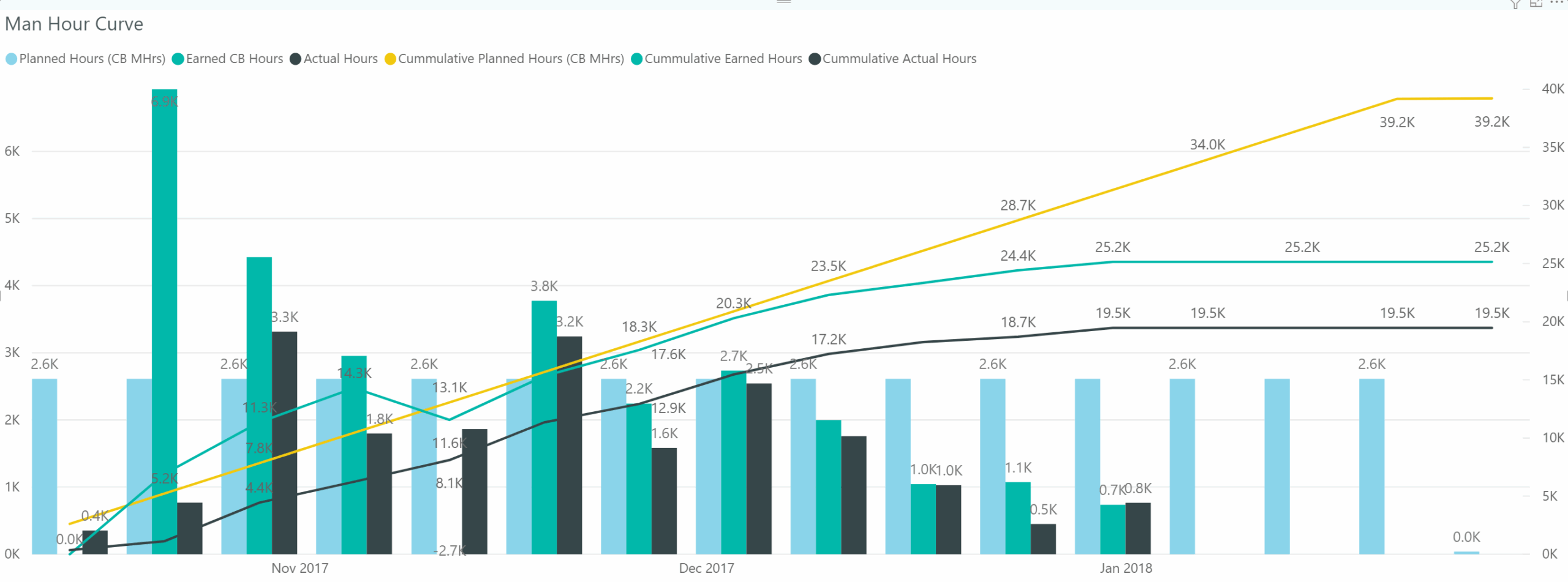
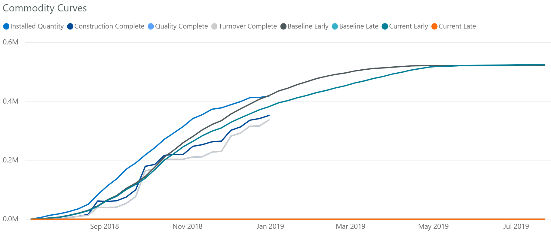
Sometimes too much information can muddy the waters, so you always want to try to keep the message clear and clean. A cumulative line chart can help with that and is something you can combine with bullet charts. And if you have data that’s moving in a downward trend, a cumulative line chart can show very quickly where you’ve got a real problem so you can communicate that out rapidly to your stakeholders.
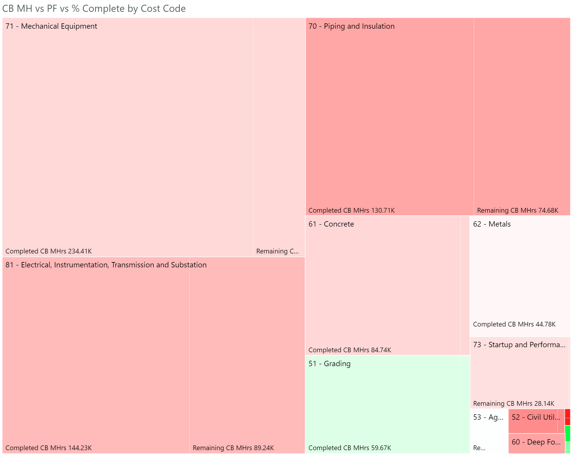
In the construction engineering industry, we are always interacting with multiple hierarchies. Tree maps can be a really good way to display a lot of hierarchical information. Say you’ve got “Piping and Insulation” which is the top level of your hierarchy, and each level goes into a lower level like “Above Ground Piping” and “Underground Piping,” etc. This hierarchy is a method for tracking my costs and productivity. You could then drill into one of the codes and start to analyze where you are performing poorly or doing really well. If you’re looking across all projects, you can easily see where you are having the most issues and then pull a team together to determine if you need to modify standard operating procedures for that specific type of work, so you can start trending in the right direction.
Another method of data visualization I want to call out, and one I don’t think is as well-known as some others, is a chord chart. Say you are interested in seeing how many issues your projects have by category. These categories might be RFIs, Change Orders, Safety Incidents, Quality Issues, etc. With a chord chart, you can immediately see which project has the most overall issues and immediately see which category of work is the largest. This tells you the important information quickly. You learn which project needs immediate assistance and where you need to focus by issue category as an entire company. A chord chart is a great way to see relationships between two data points quickly.
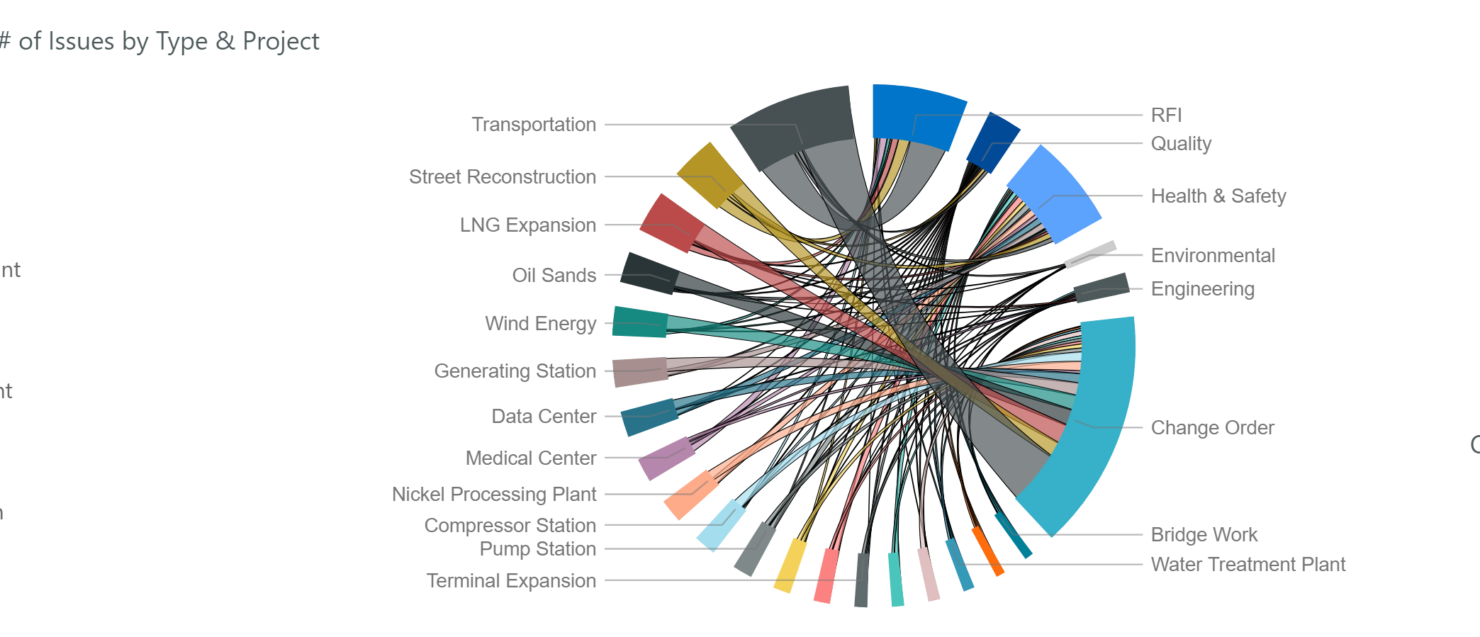
In my own experience, every time I’ve shown a chord chart, people seem to immediately grasp it, and they understand it the next time as well. And with today’s more advanced data viz tools, there is also a heightened level of interactivity. So, if you want to focus on one aspect of a particular chord chart, you can simply click on a mark and it will highlight the peaks that you want to see and then put everything else into the background.
And a quick word about pie charts. With these traditionally multi-colored charts, it can be challenging for viewers to figure out which piece of the pie is bigger than another. This visual is best suited for information that is binary, meaning true/false or yes/no. Comparing slices of a pie with two variables is relatively easy, and exact percentages or values typically don’t matter, only which is bigger or smaller. What is tricky with a pie chart is when you use data that has an infinite amount of possibilities, such as category or status. This makes it harder to control how the visual looks and is interpreted — and the last thing you want when building visualizations is for the interpretation to be left to the user. You want each visualization to be purposeful, with the goal being when two different people view a chart, they both arrive at the same conclusion.
Understand Growth, Adoption and the Art of the Possible
We’ve talked about what kind of formats to use and when, but there’s a lot more to successful data visualization than simply what things look like. I want to emphasize it’s the communication level that matters. And that’s the one thing that I think data visualization can do extremely well, but only if you have the right tools. You must drive a shared narrative or shared understanding. It’s that shared understanding of what the information is saying that can help you create a collaborative understanding across a project, especially for those not in the data field.
This is where the art of the possible comes into play. The art of the possible refers to showing people concepts and ways of doing things they never thought were even on the table, let alone attainable. Often when you try to explain data visualization to a person who has never heard of it, it’s hard to communicate what you mean. But when you show them, you get a much better response. Data visualization is also about growing your business. Virtually every organization where data visualization has been adopted and promoted has grown organically. And once people start seeing that growth and what is truly possible, they start getting excited because now, they own it.
Like any new concept or technology, when it comes to getting your stakeholders to embrace data visualization, it’s really about trust and a feeling of ownership. It won’t happen overnight, but if you can start incorporating some of the best practices we’ve discussed here, you’ll soon find that you can build that trust day by day, project by project, and well into the future.


